U + I = UI
I recently had to change my cell phone service provider. I would never have left Verizon (still claim they are the best) but somehow their service around my home sucks! So I mentally prepared myself for a phone. No digging deep into my pockets for a device which will play mp3's, allow me to IM, serve as a camera + video camera, have some colored tooth, internet browsing, windows media player etc. which also serves as a phone. Bottomline - control the geek in me..... and of course, spend minimum.
I ended up buying the Sony Ericsson Z-500a.
Now I am sitting home looking at this phone comparing it to my LG VX6000. OK, for its price and features, the phone aint bad at all. It lacks the the classy look of the LG. But the bad part is some of its design features.
Lets take this a little further. On your cell phone, you get into "Menu" and then hit "Contacts". Mostly you will have a list which will read as - "List Contacts", "New Number", "New E-mail", etc. Gee, now you realise that this aint what you were looking for. You were looking for the camera feature of this phone.
Next logical step: Hit Clear or CLR or "C" (as seen in most of the phones).
The user model of the clear button or anything which says "C" is you either go back to the previous screen or just clear out to your main screen. Oh well, thats how it has been with my LG and the phone we have back in India.
Back to the Z-500a. Hit the key "C" and the screen just stares at you. Hit it again and still no effect. Now look closely at this picture.
The Z-500a
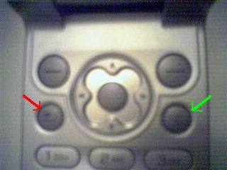
There are 4 round buttons. The round button the green arrow points to is "C" or clear/cancel (whatever you wanna call it). The red arrow points to a button which had a u-turn shaped arrow on it. I figure this means "Back". So here is the key. Hitting "C" will not clear the screen or rollback. There is a special key to take care of this functionality. So whats the "Clear" key for? When you type in text and if you type texy instead of text and wanna clear the "y", you use clear.
Well, as a concept, its pretty clear. But for someone used to the "Clear" key taking care of everything, its frustrating. You hit the "C" key and wait. Then you hit it again and wait. You think something is wrong with the key. Finally you realise you have been hitting the wrong key. Is the UI bad? No. Its not. So that means the LG UI was bad? No, that was not bad either.
Eh? Am I actually going to learn anything from this post then?
Lets go back to what we are good at. Computers. Operating Systems. The Mac and Windows. Imagine if in the Mac, if you have to move a window, you can grab it by any edge and move it. In Windows, you need to move it using the title bar. For a Windows user working on the Mac, a task of resizing the window will result in moving the window. Very very frustrating. And you say the Mac is known for a poor UI? Of course not. Anything which comes out of the Apple store is known for its pretty face. The world claims the Mac to be pretty and Windows to be loaded with features. But thats a story for another time. The point here is ease of use.
Hmmmm... now we are getting somewhere. I might actually learn something out fo this.
In UI design, you have to see two aspects. User model and Program Model. You have to match the user model.
If your Program Behaves the Way users thought it would, then you have a well designed UI.
The mac OS works perfectly fine.... for Mac users.
The UI design has to be made keeping U and I in mind. You, I and the others. Usually ten of us.
Oh, by the way, the Z-500a does have a camera, video recorder, IM, web browsing, speaker phone, media, etc. And only worth $50. Not bad eh? Of course, I dont know if I am going to stick to it... that "C" key is very frustrating indeed.
posted by APOO at 12:17 AM
![]()
![]()


4 Comments:
colored tooth = blue tooth?
He he!
"You, I and the others. Usually ten of us."
Why ten? Or did you mean tens?
Anonymous:
Yes, colored tooth = bluetooth. Its my PJ! ;-)
No, I did mean ten of us. Usually its believed that after taking into account about 5-6 users behavior with your UI, the others just repeat what these first 6 did. I said 10 just to be safer. Its kind of safe to design/modify your UI based on the action of these 10 users.
Maybe stick to Nokia for a really user-friendly (also called "intuitive") menu and better overall design! That's my experience
See my latest posting on:
http://ivorsblogg.blogspot.com/
By the way, your asumption that just 10 users can cover the whole world population's various needs and foibles regarding UI design and use is utterly amazing (and wrong)!!!
Good luck!
Nice way of comparing UI.
Post a Comment
<< Home